DELIVERABLES.
ELEMENTS.
Logo Design, Color Palette, Typefaces, Website Elements, Patterns,
PROJECT OVERVIEW.
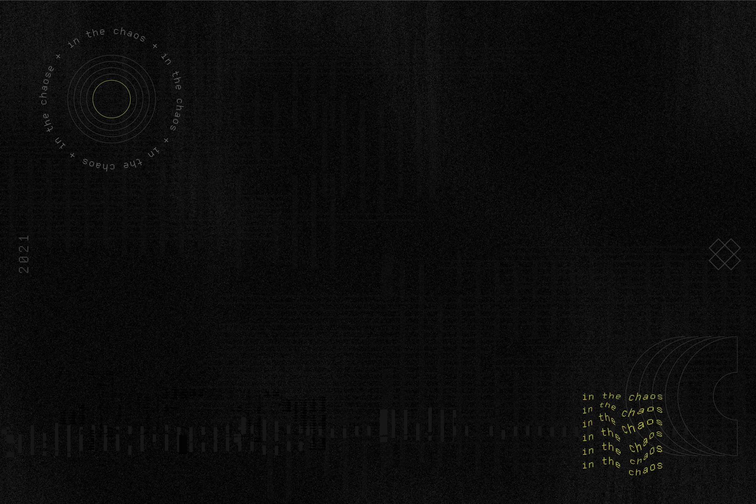
For their summer camp, Kairos, the youth group of Hope Chapel, themed their event "In the Chaos." The theme visuals resonated with then-trending contrasting black and neon color palettes and the funky, wavy patterns of grids and geometric shapes. The bold and eye-catching aesthetic captured the energy and spirit of the summer camp experience.
Due to time constraints, the visual identity was strategically designed as a toolkit of parts, including logos, typefaces, patterns, and icons. This approach empowered the students and volunteers to create their own designs while maintaining a cohesive brand identity. The toolkit provided a foundation for creating slides, social graphics, and other materials, allowing the creative team to express their own unique style while staying within the provided visual guidelines.
By providing a toolkit of design elements rather than pre-made templates, the visual identity encouraged creativity and ownership among the students and volunteers. This approach struck the right balance between providing resources to support design efforts and empowering individuals to contribute their own ideas and perspectives.
The "In the Chaos" theme, coupled with the well-crafted toolkit of design elements, resulted in a visually engaging and impactful summer camp identity.


