
DELIVERABLES.
ELEMENTS.
Logo Design, Color Palette
PROJECT OVERVIEW.
Project Overview…

Crafting a brand identity is like charting a course – you need a bold, creative direction that sets you apart, but also a guiding principle to ensure a cohesive visual journey. Here's why having a clear "true north" for your brand design is essential:
While boldness is exciting, it needs direction. Your "true north" – a set of core design principles like color palettes, typography styles, or image aesthetics – keeps everything aligned, creating a memorable and recognizable brand experience. Think of it as the anchor that holds your creative soul steady.
In essence, your "true north" provides the foundation for a
brand identity that's both audacious and unified – a design direction that truly captures your brand's essence and sets the stage for success.
Our quilts are bold statements, a tapestry of geometric patterns and Art Deco elegance, made with powerful precision and a touch of playfulness. Imagine jewel tones – blue, green, teal – dancing across the fabric, each stitch a testament to the confident maker. These aren't your grandma's florals; they're heirlooms for the future, crafted with the sophistication of a bygone era and the audacious spirit of the modern age.
What You Make Matters stands confident, a beacon for those who dare to express themselves through creation. We’re a brand that doesn't need to please everyone – we inspire those who resonate with our message.
We are not about fleeting trends or cutesy frills. We celebrate the bold and empathic creator, fostering a space of inclusivity where everyone feels empowered to explore their craft, be it quilting or venturing into new artistic territories. Our projects are a physical embodiment of this philosophy - a promise of care, a testament to the timeless power of intention. They are a reminder that every stitch, every brushstroke, holds the potential to create something remarkable. We're designed to be recognizable, a signature statement that proudly declares, "What You Make Matters.”
Your primary logo is your brand's hero. It's the one you'll use most often and should be instantly recognizable. Think of it as the face of your brand. While you might have fun seasonal variations or even product-specific tweaks, the core design – the "bones" of the logo – should always remain consistent.
This logo is a variation of your primary logo. It is stacked to provide a more legible lockup to use depending on the background imagery or any size requirements.
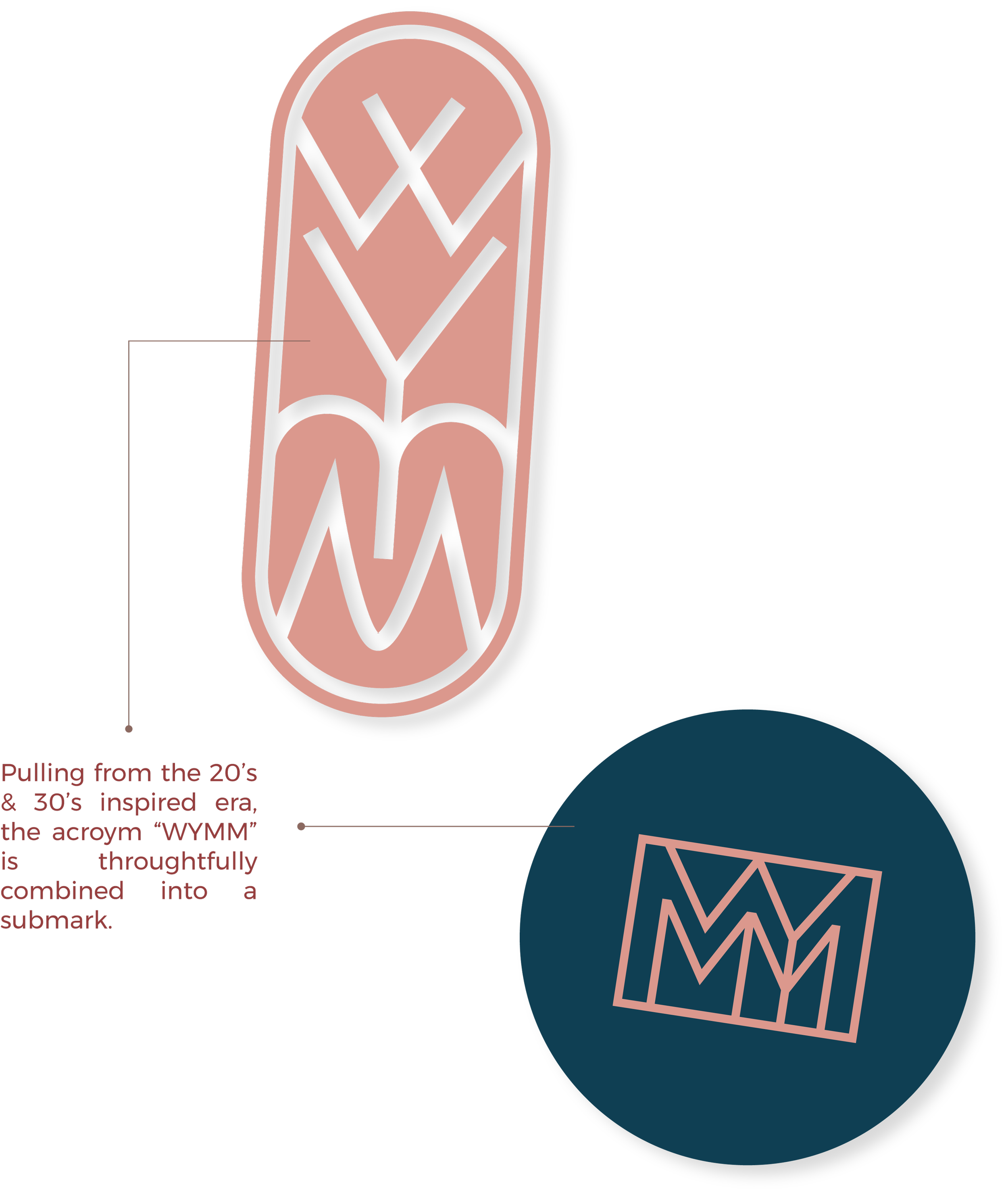
The submark logos are your brand's supporting teammates. Think of them as a simpler, more versatile version of the main logo. Perfect for those social media icons, favicons, or anywhere your main logo might be too crowded.
The logomark in this instance is an abbreviated version of the logo. Think of it as the brand's visual shorthand.
Typography is the unsung hero of branding. It's the voice behind your brand's visual identity, setting the tone and quite literally, how people take in your message.
Here you’ll see examples of the typefaces in action. Take note of how the fonts establish a clear hierarchy, and how secondary and accent fonts provide tasteful support. Maintaining consistency in sizing, hierarchy, and overall application is paramount for building a cohesive brand identity.
A color palette is your brand's color toolbox. It holds the key hues and tones that visually represent your brand identity.
Patterns and elements are the brand's personal touches, the flourishes that bring your logo and colors to life.
Quilting and crafting inspired textures used in addition to the Art Deco patterns give your brand it’s own unique take on classic yet bold.
This style combines warm lighting, natural textures, and inviting compositions to showcase your quilts, crafts, and the creative lifestyle they inspire. Utilizing light allows you to control the shadows to create a moody but clear product shot.
Visual mockups are like a brand come to life. They take your logo and brand elements and place them in the real world – on websites, apps, or social media. This lets you see how everything works together to create a seamless and impactful experience. It's the difference between trying to picture your brand coming to life and actually getting to see it (well, digitally of course) on products that you can imagine holding!


